

Risk and Uncertainty: Disconnected


From Wikipedia:
“Policy uncertainty (also called regime uncertainty) is a class of economic risk where the future path of government policy is uncertain, raising risk premia and leading businesses and individuals to delay spending and investment until this uncertainty has been resolved. Policy uncertainty may refer to uncertainty about monetary or fiscal policy, the tax or regulatory regime, or uncertainty over electoral outcomes that will influence political leadership.”
The Economic Policy Uncertainty index (EPU) has been rising lately, with good reason (purple arrow on chart below). Elevated uncertainty in the era of the Donald is perfectly rational since not even the Donald knows what he is going to do next.
What is not rational, however, is how certain equity investors are about future equity valuations. Investors are so certain prices will continue to go up, that they aren’t bothering to hedge their long positions, which has led to near historic lows in the VIX, while policy uncertainty continues to increase (red arrow on the VIX chart below). If a fire breaks out in the house, nobody has any insurance.


Typically, high EPU is accompanied by high VIX. At the moment, the EPU is well above average at 137 (average is 104), and historically, the VIX has averaged 24 at the current EPU level, but is only at 12, half of the average (chart below).

The disconnect in uncertainty and fear, although capable of lasting an indeterminate length of time, is of some concern to us at this time. The market is climbing a wall of worry, until it falls off the other side — unfortunately, no one knows the height of the wall.
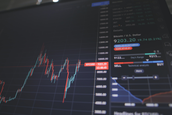
Equities
{This section is for paid subscribers only}
The put:call ratio, despite the 80% correlation between down-spikes in the ratio and tops in the SPX, can’t seem to stop the rally in the S&P 500 Chart below).

The Rydex bear:bull assets ratio continues to warn of a top (red arrows on the chart below).

{This section is for paid subscribers only}
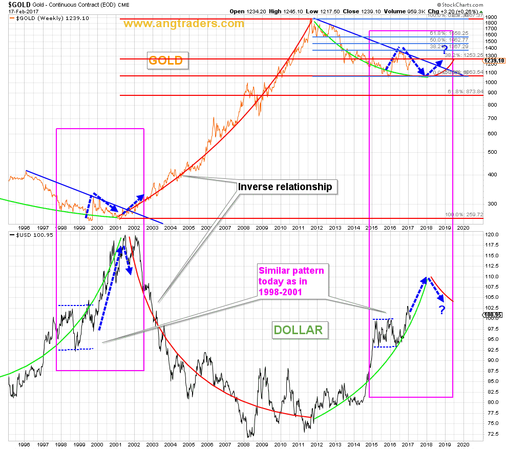
Gold
{This section is for paid subscribers only}
The chart below shows the long-term inverse correlation that exists between the dollar and gold, and highlights the striking similarity in the trading of 1998–2002, and that of today (pink rectangles).
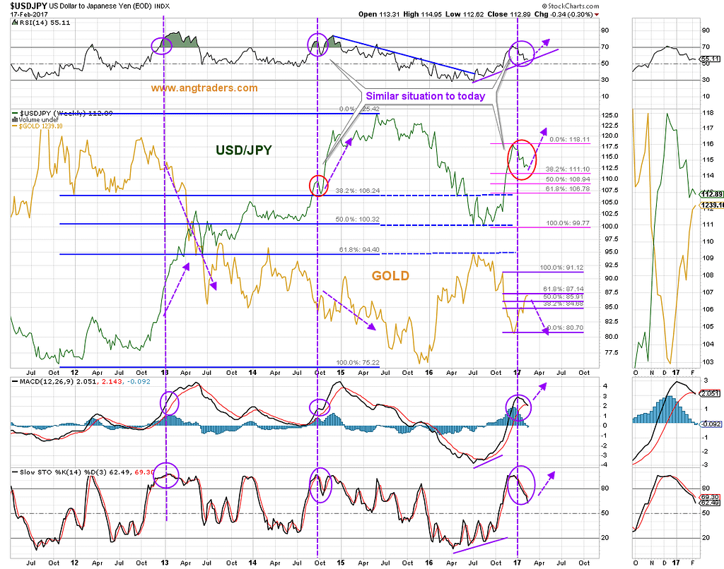
The USD/JPY ratio continues to trade down to its 38.2% Fibonacci retrace line, like it did in late 2014 (red circles on the chart below).
{This section is for paid subscribers only}
We wish our subscribers a profitable week ahead. Please monitor email for Trade Alerts.
ANG Traders
Join us at www.angtraders.com and replicate our trades and profits.
Source: Nicholas Gomez